Business Intelligence & Reporting
Build dashboards, track KPIs, and automate recurring reports.
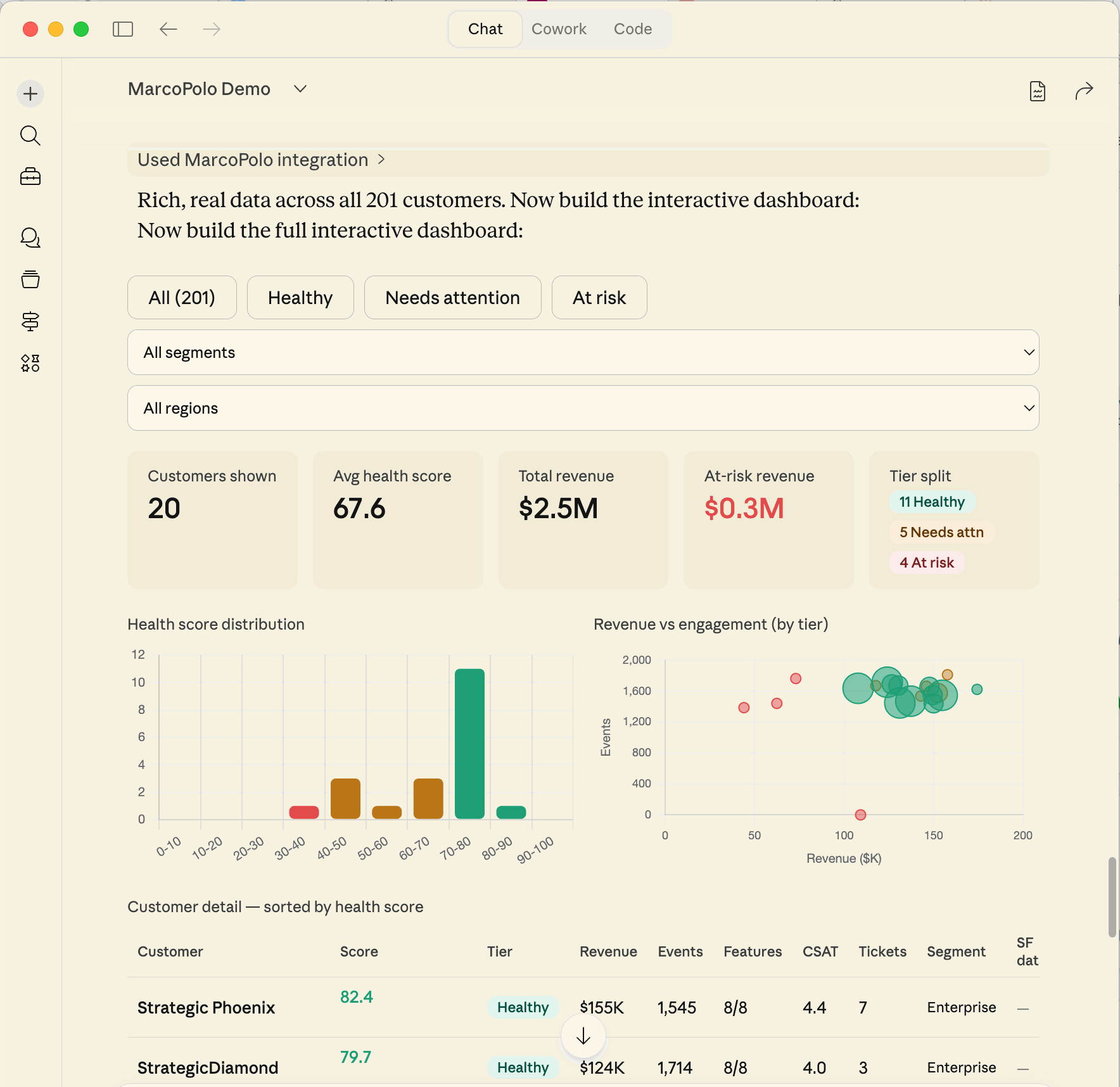
Describe what you want and your AI builds it: dashboards, KPI reports, recurring summaries. No data model setup, no visual editor, no maintenance when schemas change.
From question to dashboard
A dashboard in MarcoPolo is two files under artifacts/dashboards/: a .dashboard JSON manifest declaring named DuckDB datasets, and a view.tsx React component. The preview_dashboard MCP tool resolves the manifest's datasets through DuckDB and renders the view.
Install the Snowflake demo, then:
Break down orders by product category and status, then build me a dashboard.
AI runs workspace_shell("connection describe snowflake-demo --database ANALYTICS --table ORDERS --json")
   → 8 columns including ORDER_STATUS, PRODUCT_CATEGORY, ORDER_AMOUNT

AI writes connections/snowflake-demo/queries/orders_breakdown.sql
AI runs workspace_shell("connection query snowflake-demo --file connections/snowflake-demo/queries/orders_breakdown.sql --json")
   → 17 orders across 5 categories, 4 statuses
   → DuckDB relation: snowflake_demo_orders_breakdown

AI writes artifacts/dashboards/orders_breakdown.dashboard
AI writes artifacts/dashboards/view.tsx
AI calls preview_dashboard(path="artifacts/dashboards/orders_breakdown.dashboard")
   → preview opens

AI: Orders breakdown:
    - DELIVERED: 11 orders, $9,833 (72%)
    - SHIPPED: 3 orders, $2,586 (19%)
    - PENDING: 2 orders, $1,195 (9%)
    - CANCELLED: 1 order, $123 (<1%)

    Dashboard is live. The .dashboard manifest references the DuckDB
    relation; view.tsx renders a stacked bar chart with recharts.
Add a breakdown by country.
AI updates connections/snowflake-demo/queries/orders_breakdown.sql to add SHIPPING_COUNTRY
AI re-runs the upstream query
AI updates artifacts/dashboards/view.tsx to render the country dimension
AI calls preview_dashboard again
   → Top countries: USA (4 orders), UK (3), Germany (2)
Dashboards have shareable URLs. Open them from the web app without rerunning anything.
For Claude Plugin users, this is a meaningful difference from a traditional BI handoff: the dashboard preview can appear inline in the same chat where Claude explored the schema and wrote the query, so you can refine it in context instead of switching tools.
Recurring reports
Once you've built a useful query or dashboard, save it for reuse. Query files already persist under connections/<name>/queries/ — re-run or modify them in any future session. For automatic refresh, schedule the upstream query through cron:
Refresh the orders breakdown every six hours.
AI runs workspace_shell("cron create refresh-orders-breakdown
  --command 'connection query snowflake-demo --file connections/snowflake-demo/queries/orders_breakdown.sql --json'
  --cron '0 */6 * * *' --json")
   → schedule saved to schedules/refresh-orders-breakdown.json
The dashboard renders against whatever data is in DuckDB at preview time, so a recurring upstream refresh keeps it fresh. See Pipelines and setup-automation for the broader scheduling pattern.
How real teams use this
HubSpot deal pipeline. A RevOps lead at a gaming company tracks all open deals broken down by stage, with line items, product SKUs, and revenue by deal. They combine HubSpot with Google Sheets and Jira data, running 349 commands across 10 active days to build a comprehensive pipeline view.
Weekly board metrics. An ops team combines Snowflake revenue data with Salesforce pipeline data and generates a weekly summary: new ARR, net retention, pipeline coverage, churn rate.
Spend management. A finance team queries invoices and orders from Snowflake, generates quarterly summaries, and flags orders not yet invoiced. The queries persist in the workspace for monthly re-runs.
Best practices
Move data shaping upstream. Put SQL in the manifest's dataset query, in saved DUCKDB queries, or in scripts under scripts/ — not inside view.tsx. The view receives data via a data prop and should stay pure presentation.
Stick to react and recharts in view.tsx. Other libraries may not be available in the preview environment. The workspace's RULES.md will say if more is allowed.
Start simple, then layer. Ask for a basic chart first, then add dimensions, filters, or data from other sources.
Ask for the format you need. If you need a chart for a slide deck, say so. A CSV for a spreadsheet? Ask for that. Your AI exports in whatever format is useful.